
All projectsStudio concept / 01—03
NOON
A little less ordinary.
Brand strategy · Identity · Packaging
The starting point
Sparkling water has a simple job. Its brand can offer something more: a small, deliberate break in an always-on day.
The idea
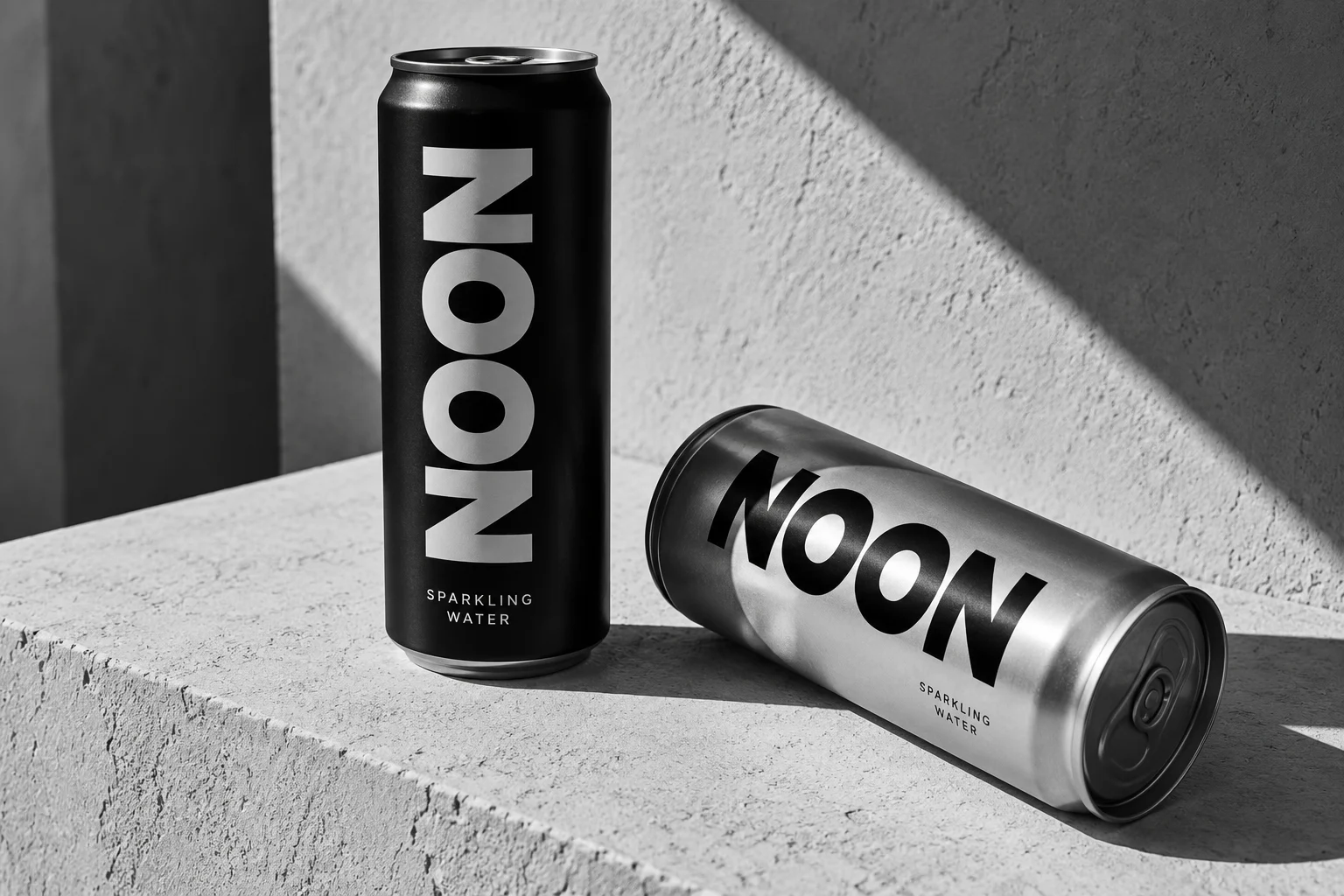
Build the identity around the pause. A short, symmetrical name, confident lettering and a restrained pack make an everyday product feel considered.
The scope
Positioning, naming direction, visual identity, packaging and launch concept.
The idea in practice
Make time for the everyday.
The system pairs oversized type with generous empty space. Black and silver distinguish the range, while a repeatable midday shadow gives photography its own recognisable signature. Every application starts with the same idea: make the ordinary worth noticing.
An independent demonstration concept, created for this website preview. It does not represent a commissioned client project or measured business results.